26th August 2025

The Atmospheres of the Willis Building

Celebrating the 50th anniversary of Foster + Partners' Willis Building, +Plus Journal looks back to an interview by architect Jeffrey Inaba with architect and professor Neil Denari, as they reflect on the landmark project.

The pair discuss how the design is an exemplary fusion of environmental performance and form-making. Denari observes that the building’s approach to environmental regulation, which he associates with the space-age desire for a wholly encapsulated interior atmosphere, as well as its subtle negotiation between its context and envelope, make it a provocative object lesson for performance-driven buildings today.
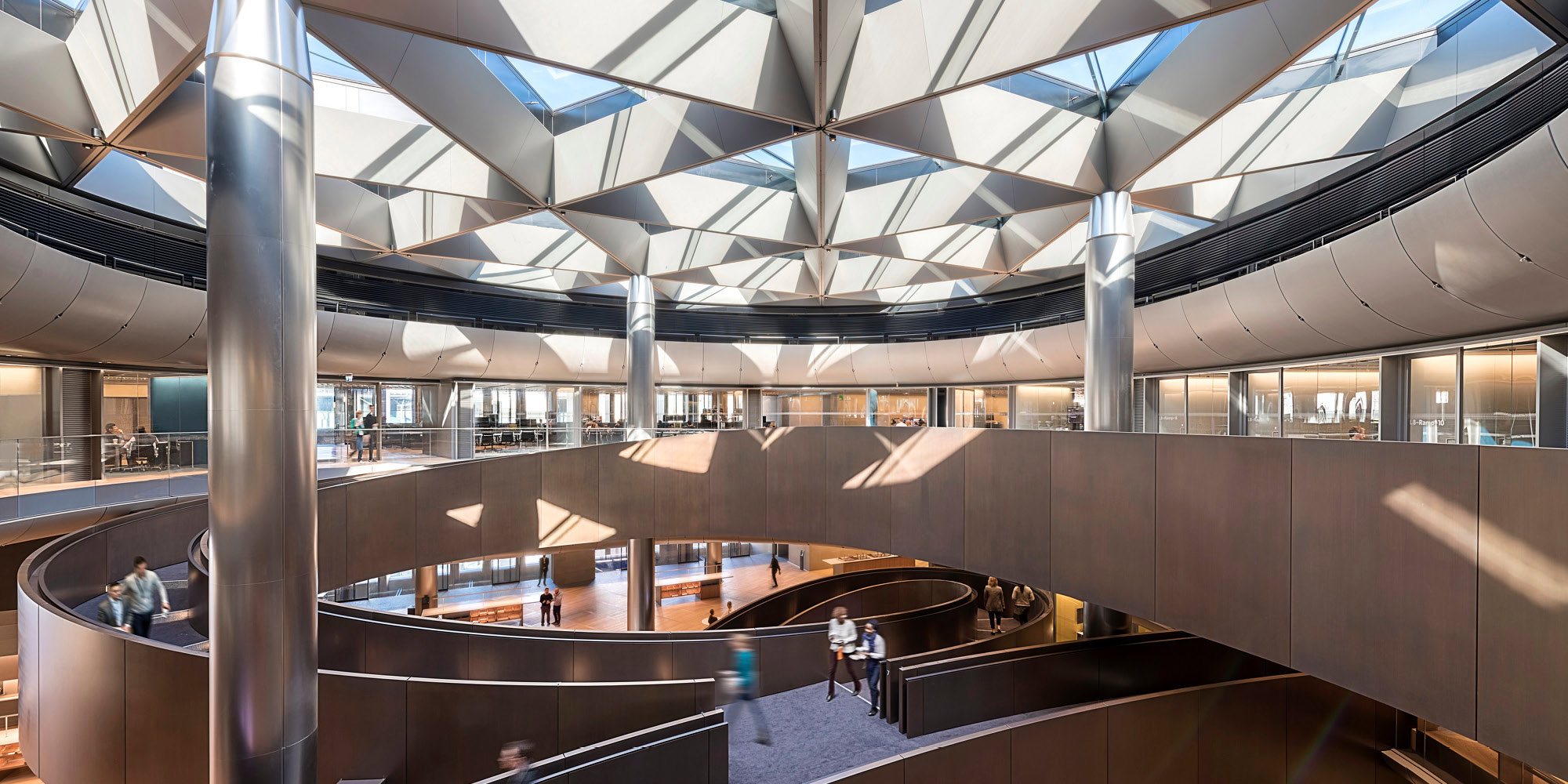
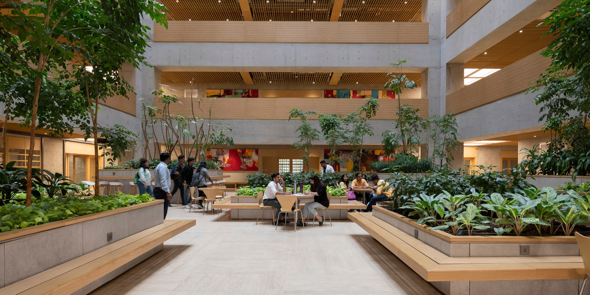
Jeffrey Inaba You have one of the few practices I know of that is designing complex large-scale projects and doing the Construction Documents in-house. I imagine that articulating the details yourself requires you to give thought to the mechanical systems (MEP), such as how they are conceptualized in relationship to the building’s form, where the larger elements are located, the nature of the core, the distribution of the tubes. Given this knowledge and sensitivity, I’m very eager to hear what building you want to discuss, and the relationship between the form of the project you’ve chosen and its mechanics. I think that you’ll have important insights about the consequences the mechanical system has to the final building design. In addition, it would be great if we could talk about the atmosphere of the building, if that’s applicable. I mean not just the climate conditions that the mechanical system produces on the interior, but also the visual and tactile effects of the space. In other words, does the mechanical system’s design contribute to the aesthetic ambiance of the building?

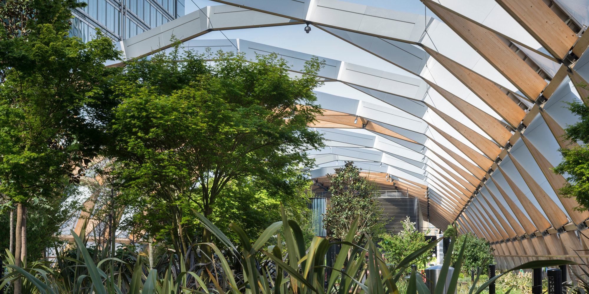
Neil Denari I think Norman Foster’s Willis Building in Ipswich [1970-1975] is interesting because, in its concern for the environment, it confronted a whole series of agendas that seemed proprietary to British architects at the time, but also aligned with a Fuller-esque optimism. And I think that, except for when it was suppressed under the rhetoric of post-modernism, the culture of how environmental and mechanical systems work has been around a long time, but it hasn’t always been played out in an explicitly recognizable way. Part of the reason why I was so captivated by this building was the green roof. And it actually wasn’t the first green roof in England. Foster apparently often used Kensington Rooftop Gardens on the 6th floor of Derry and Toms department store in London to talk about green environments with clients. But what was interesting about the Willis Building green roof was that they swapped out all the mechanical from the roof and put it on the first floor along with the lobby and a swimming pool. Now someone might laugh at the idea of having a green roof in a climate where it rains most of the time but what the roof did was insulate the building like crazy; in fact, it was much better than a built-up system with insulation because it had depth and a lack of thermal oscillation and transfer. The heat loss at the top of all buildings is super important to control. The amount of roof surface area for this building is actually far greater than the façade area because the plan is so big. The other advantage to the green roof was that it allowed the elimination of expansion joints within the building, which meant that they were able to take out the double rows of columns that typically run along joints because the building’s temperature wasn’t changing very much and therefore it wasn’t moving around much. It’s astonishing that the roof as an insulating surface changes the environmental conditions to that degree.

The second thing that really captivated me about the building is that it was one of the first British interiors with yellow and chartreuse. The colors were part of this programmatic logic—not a mechanical logic as in the color-coding of the Pompidou Center later in the decade. The carpet in the building is chartreuse. Then, the ceiling is a polished aluminum baffle system and the lights are spread out pretty far apart. The reason for these two things is that the color of the carpet mixes with the color balance of the lights and the reflectivity of the metal ceiling spreads the light out in an incredibly balanced way. So even in such a grey outdoor environment, they were able to dramatically reduce the lighting. It creates this incredible atmosphere.

If you think about the layers of the building—the ground floor being mechanical, the roof being grass and the intermediate floors being these chartreuse carpet tiles there is this apparent analysis of performance characteristics on every surface of the building. This goes directly back to the general idea about how choices affect form and atmospherics. I think in this case the negotiation between the form and the mechanical system was symbiotic and very much interconnected. On the one hand, the gestalt aesthetic was one that they very much wanted anyway as a reflection of vitality and progress, but on the other hand there is this incredibly clear idea of evoking performance. Banham argues that all of the colors came from Archigram and Peter Cook’s Plug-In City—which he claims originated with Pop graphics—and Foster takes this, analyzes it and discovers that it can be weirdly useful as a performance device.

JI So do you see this building’s design strategy applicable to other sites? The building’s blob-like shape is so unusual though one can understand it to be an expression of the site boundaries. I wonder if the project could be understood as a brilliant repeatable formula where there is a rational grid that is sized for a specific occupancy load but the shape is an expression of the building’s lot perimeter, thereby producing a unique form in each new location.

ND I think there’s a real sense of this project being sort of like a uniquely styled generic building that could be repeated again and again, but only in its own format—and that’s a deep plan building. You could use this building as a prototype, take it out and put in the landscape, and use the same deep building type but make it a giant square and the project will still be exactly the same. The shape of the building, to a certain extent, could be seen as a kind of non-sequitur to all of the issues going on in relation to the building’s grid. In essence, everything inside is this rational way of dealing with things—the grid for furniture, the basic void of the atrium—but the perimeter is trimmed and cleaved by the site. So the perimeter becomes a response to literally everything outside. I actually think this building could be done with any perimeter geometry. So the shape became this kind of egg or blob, so to speak, because a nearly parametric model was developed to gain as much internal space as possible. I find it particularly interesting that this contextual and spatial issue was solved with this all-in-one move that involved the form of the building.


JI Today’s conventional mechanical systems act on entirely enclosed environments to create artificial climate conditions. They engender this intense separation between interior and exterior worlds. How is this played out in the Willis Building? Does the mechanical system contribute to the creation of a completely separated inside environment? From an urban design perspective, it appears to make a dramatic statement about the isolation of the building from its context. Its undifferentiated high-tech glass façade makes it appear particularly alien from the other buildings in the same fabric. Or do you think there’s something else going on as far as the project’s relationship to its surroundings is concerned?

ND At the time—the late ’60s Earth Day era –Foster and Fuller were working on a number of projects together. For instance, they were doing one called Climatroffice which was a big space frame ellipse with a series of terraced floors, a kind of dome over Manhattan that would turn the city into an office building. It was somewhat similar to Fuller’s Expo 67 sphere—one massive environment with its own local ecologies that would generate an artificial nature. There’s an atrium in the building which works in a classic way to move air around, to let in diffused light and to make a kind of “community” within the space. So in terms of its makeup and organizational system, the building is quite conventional, but if you look past that to the material and atmospheric effects— including the palm trees in white ceramic pots on every floor—you can see this utopian atmosphere that Fuller was going for. Outside you have grey skies, but inside there is this construction of nature in a way that is artificial and lurid, but also bona fide.

I think it is interesting that this was even a conversation at the time. And I think that London was a real center for that conversation, whereas it wasn’t yet present in the US. This project did make a statement about the environment in that context, which was the idea that buildings are artificial worlds, buildings are thresholds, and more than anything they are mediators between human comfort and the conditions of the outside world. This project was very much driven by Fuller’s interest in the vessel—the idea that you go through a revolving door and there’s no air transfer between the outside world and the one you enter. They saw that as being optimum and very contemporary, so far as late spaceage capsule technology was being played out in architecture.

Foster’s present-day work is a completely different story. We are living in a world that is very transmissible—between people, between public and private, and between inside and outside—and there is this desire to make the building dissolve into nature even more. In the Willis Building, it was trying to make the building dissolve by using glass, but there was still this very strong distinction between inside and outside.

JI At the time that the Willis Building was designed, there was much discussion about the organization of the workplace. It had to do with the growth but also instability of large corporations. In that context, the work environment was being reconceived. Do you think the changes in thinking about the corporate workspace had an influence on the layout of the building? And if so, in what ways did the mechanics help to shape that corporate space?

ND For Foster, discussion of the project began with the program. The building is occupied by a large insurance brokerage. It was also done at a time in which different spatial politics existed and industrial design and pre-fabricated furniture systems were on the rise. The plan was so deep that lighting the space became a concern and, of course, enclosed offices wouldn’t work unless they were on the perimeter; that is why they came up with the chartreuse carpet and aluminum ceiling system to deflect light. You have to remember also that these were the early days of when people were shifting jobs more frequently than before so desks weren’t going to be occupied for more than a few years in a number of cases. So there was this need to be able to scale up and down to the number of employees at a given time. The space needed to be convertible from gathering spaces to office cubicle areas. So the politics of openness came into play on both a spatial and political level.

JI Today there is a conflation of the aesthetic of sustainability and the performance of a building. That is, if a building has visibly noticeable sustainable features then it is assumed to perform well environmentally. The assumption is that it is working better from an ecological standpoint than those that do not appear to have sustainable functions. Sometimes the sustainable bells and whistles overshadow the fact that the building’s green scorecard is underwhelming. In contrast, there are examples where an architect has created a sustainable building but has not felt the need to express those environmentally minded functions in a literal way and has chosen instead to integrate them smoothly into the overall form. What do you think are the factors at play in the iconography of performance?

ND That’s an interesting point because the contemporary response to the sustainable is embedded with more than just numbers or performance criteria. It also has to do with social space and having a building essentially defer its status as a sign or icon to become something less spectacular. That is the creeping moralism behind some of the sustainable ideology out there.

I absolutely agree that there is a conflation in the contemporary discourse surrounding office buildings about what the envelope is aesthetically and what messages it sends in terms of environmental performance. There is this convergence between real-estate agendas and the logic of mechanical system performance. The corollary to that would be Rogers’s buildings in the 1980s —particularly Lloyds of London—where office buildings use the same sort of strategy: an atrium building with the services put on the outside so that the floors can be thinner and therefore more floors can be added to the mass. But you know as well as I do that all of these things just presented a series of excuses to essentially find new aesthetic territory for those architects and did very little in the way of actual progress in terms of performance.

JI Has re-visiting the Willis Building altered in any way your design perspective? And if so, how? Can you refer to a particular project?

ND I think work being done today is in many ways returning to an ethic and an ethos of performance. Looking back at the Foster work has made me much more conscious overall about that and has also made me feel more free about the idea that every project can do what it needs to do in its particular place, location and program. And although I think that there is an imprimatur on almost everything, the range of the office’s work is now wider than ever. And I’ve kind of come to appreciate that about Foster’s work as opposed to relegating it to the scrap heap of corporate production.

When I was a younger architect I might have been more interested in Lloyds of London just because of the pure spectacle of the hardware. Coming back to this glass building has been interesting because it produced at the time a more supple relationship between how it works programmatically, its response to its context, and how the mechanical system reacts to those desires, as opposed to simply becoming a driver of aesthetics. We’re not exactly doing that today but with projects like the one we did in Taiwan recently, which is a 590,000 sq. ft. office building with a very thin floor plate of 17-meters-deep, we are trying to take up the issue of the work environment, the site, and the envelope capacity. The building is a thin loft building coiled into a big donut shape; a much different massing strategy than the Willis Building, but it tries to deal with some of the same concepts.

Like most people, I have been very willing to enter into these conversations about form and aesthetics in relation to sustainability, hoping that the work of this earlier period could be seen, not as something to be emulated per se, but as a forerunner for imagining a new aesthetics. What has been interesting about going back to look at this building, and to a certain extent the work of Foster in general, is understanding that its relationship to form is environmentally driven. So I think the building can be used to drive a dialogue about the negotiations between form and performance.

This interview was first published in Volume 37: Is This Not a Pipe? edited by Jeffrey Inaba and C-Lab (Fall 2013).

Author

Jeffrey Inaba and Neil Denari

Editors

Tom Wright and Clare St George